Colors of Thanksgiving
Norman Rockwell Museum)
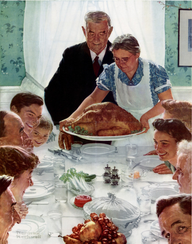
As many folks celebrate Thanksgiving this week, I had an impulse to revisit Norman Rockwell’s iconic painting, Freedom From Want—and to consider Rockwell’s use of color.
As many folks celebrate Thanksgiving this week, I had an impulse to revisit Norman Rockwell’s iconic painting, Freedom From Want—and to consider Rockwell’s use of color.
Lately I’ve been asking myself how far I can go simplifying color and still create a successful piece. Most of my work involves a limited palette, though the specific colors in that palette can vary from project to project. While glass is not paint, it’s interesting to explore from a painterly perspective how restricted a palette one can use in glass and still achieve an effective work of art.
If you’re looking for some fascinating inspiration (or distraction) today, check out this 2016 piece from Hyperallergic about what led to one of the first modern color systems.

Chromosome Painting by Geraldine Ondrizek, 2012 (Image via Reed)
So speaking a little while ago of DNA inspired art, I recently learned about Geraldline Ondrizek’s Chromosome Painting and couldn’t resist sharing.

Night view of Sports Center by KOZ Architects (Image via TheCoolist)
Would your kids be more motivated to play and get exercise if they could be immersed in fun, bright colors while doing so?

My art glass wall offering style to a wedding reception at Loews Minneapolis Hotel, formerly known as Graves 601 (image via Studio 306)
Anything look familiar in this picture?

Samples of fused glass
Maybe it’s the bright colors, or the way those colors make light dance, or something more nuanced about the lines – but there’s something about fused glass stripes that really capture this time of year for me.

Nature inspires concepts for many of my full glass art works; but it also influences my experiments in textured glass on a more minute level.

Last week, I shared a custom glass art screen inspired by the Rhode Island wetlands in spring.

Much of my custom glass art work is inspired by the colors of nature. For example, the piece shown here draws from the bold colors of Rhode Island wetland habitats that are emerging right now, in spring.